

Some developers think in terms of “cleaning up” the UI when their app is almost finished. Sometimes they just don’t care and sometimes they do, but don’t know how to create compelling user interfaces. And while a big part of beautiful interfaces is a matter of creativity some aspects are just rules that can be learned.
A grid system (or typographic grid) is a structure used to organize text and images. The image below from wiki will explain it immediately:
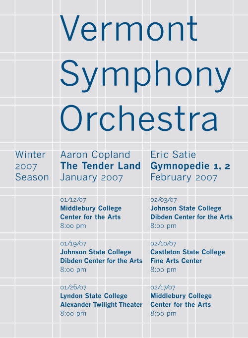
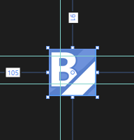
You see that every element is “glued” to help lines. In design software these lines are called guides. Expression Blend for Visual Studio 2013 introduces guides and you will learn how to use them to improve your UI designs!
Following the windows 8 grid system Let me first show you a baseline:
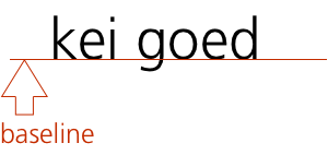
The baseline of the page header is placed 100 pixels from the top. Let’s create a guide for this.
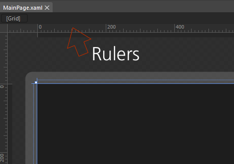
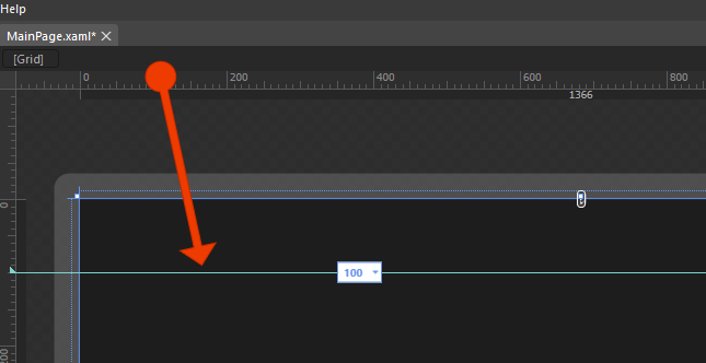
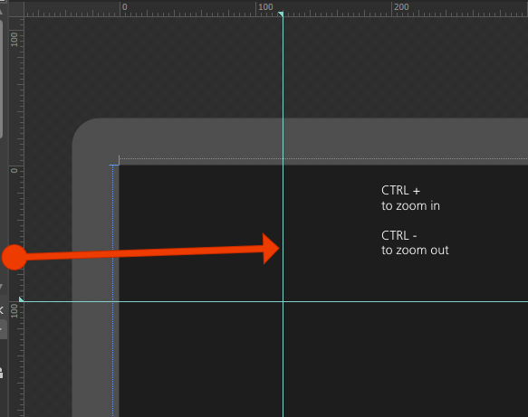
If you have trouble dragging it exactly to 120 pixels, zoom in with CTRL +. OK, with the guides in place,
textblock

Guides will help you to layout your UIElements. Keeping everything tight on a grid will greatly improve the overall design.